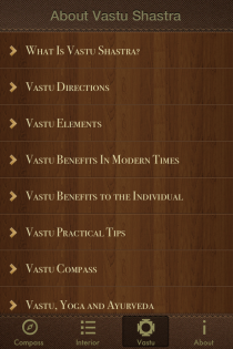
Check if your home is in harmony with the laws of Nature


Essence: Choose colors that align with elemental directions to support health, prosperity and calm. Vastu Compass applies classical Vastu Shastra principles and modern color science to recommend hues, finishes and placement so each part of a home resonates with natural laws.
Vastu ties color to the five elements and to directional energies. Classical texts such as Manasara and Mayamata describe orientation, while Brihat Saṃhitā (6th century CE) records environmental practices that influenced later Vastu norms. Colors amplify or soften elemental influence: fire tones stimulate, water tones soothe, and earth tones ground. Practical use requires attention to room function, natural light, and occupant sensitivity.
Below is a directional matrix summarizing elemental associations, recommended hues and high-level decor tips. This matrix is placed inside explanatory text so it appears amid discussion rather than at the start or end.
| Direction | Dominant Element | Recommended Hues | Decor Tips | Typical Saturation |
|---|---|---|---|---|
| North (Kubera) | Water | Soft blues, aqua, pale teal | Use reflective surfaces, mirrors on north walls; avoid heavy red | Low-medium |
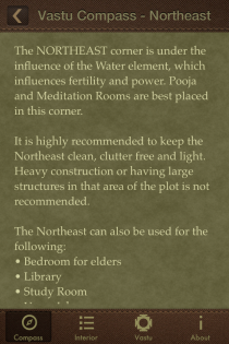
| Northeast (Ishaan) | Light/Akasha & Water | Off-white, very light blue, pastel green | Keep clutter minimal; place puja or meditation area here | Very low |
| East (Purva) | Air & Sunrise | Light yellows, saffron, warm cream | Emphasize morning light; sheer curtains, light wood furniture | Low-medium |
| Southeast (Agni) | Fire | Orange, coral, warm terracotta | Kitchen or appliances fit here; avoid excessive dark tones | Medium-high |
| South (Yama) | Fire & Earth | Brick red, warm terracotta, muted maroon | Use for active zones; balance with neutrals to avoid aggression | Medium |
| Southwest (Nairutya) | Earth | Beige, sandy brown, warm greige | Master bedroom placement; heavy furniture and solid colors work well | Low |
| West (Varuna) | Water & Metal | Steel gray, soft indigo, slate blue | Good for dining or informal areas; choose matte finishes | Low-medium |
| Northwest (Vayavya) | Air | Light gray, pale mauve, sky blue | Guest rooms, circulation areas; ensure color supports ventilation | Low |
Living Room: Use warm neutrals anchored by a dominant color tied to the room’s direction. For an east-facing living room, a warm cream with saffron accents encourages lively mornings. Balance sofa fabrics in mid-saturation tones and keep heavy reds to corner cushions rather than wall surfaces. Natural fiber rugs and soft lighting will moderate color intensity.
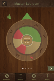
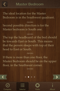
Master Bedroom: Place this in the southwest when possible. Earth tones like warm beige or soft greige foster stability. Use a darker headboard with lighter walls to create grounding. Avoid bright orange or strong reds that raise agitation. Layer textiles in varying textures rather than contrasting colors.
Children’s Room: North or east-facing rooms benefit from cheerful pastels. Use soft greens and blues to calm and support concentration. Reserve brighter hues for toys, artwork and removable accents. Ensure paints are low-VOC and washable.
Kitchen: Southeast is ideal for the kitchen. Fire tones such as terracotta, warm orange or copper-like accents reinforce digestive energy. Countertop neutralization with white or gray balances heat. Use heat-resistant finishes and reflective backsplashes to distribute light.
Dining Area: West or east dining rooms respond well to muted blues, warm grays or soft indigos that encourage relaxed conversation. Avoid extreme saturation; instead opt for accent color on one focal wall or table textiles.
Home Office and Study: North or northeast orientation supports focus. Pale blues, soft greens and cool neutrals aid cognitive clarity. Use high-contrast trim for shelving and ergonomic furniture in darker hues that signal structure.
Bathrooms and Utility Areas: North and west are preferred. Cool blues, aqua and soft grays create a clean, calming atmosphere. Use moisture-resistant paints and tiles; maintain bright, even lighting to show true color.
Shade selection matters more than base color. Lighter tints open small rooms; deeper tones work in large spaces. Saturation controls energy: muted tones soothe, saturated hues energize. Fabric choices influence perceived color; silk reflects more warmth than cotton. Matte finishes hide imperfections, while satin or eggshell balances reflectivity without glare.
Lighting shifts color dramatically. Northern light leans cool; southern light leans warm. Test samples at morning and evening. Coordinate furniture by pairing a dominant color with two supporting neutrals and one accent color to maintain Vastu balance. Use plants and wooden elements to bridge color palettes.
Common mistakes include overusing red in bedrooms, placing dark colors in northeast corners, and ignoring light direction. Quick remedies are inexpensive: swap curtains, add greenery in required directions, or use removable wall panels to change dominant hue.
Before painting, follow these steps:
DIY checklist:
A Delhi apartment with a southwest bedroom painted deep blue was shifted to warm beige and layered terracotta accents in 2022; residents reported improved sleep and reduced stress within six weeks. A Mumbai home with a kitchen in the northeast saw better meal routines after adding a warm yellow backsplash and moving the sink to the southeast corner.
Common questions:
Further resources include classical Vastu texts and modern color theory references. Vastu Compass offers calibrated color palettes and printable orientation charts to test choices before committing to paint. Follow local building codes and consult professionals for structural alterations.